|
|
| Line 11: |
Line 11: |
| | ==Installation== | | ==Installation== |
| | | | |
| − | To use a specific tileset with Dwarf Fortress, you must perform the following steps: | + | To use a specific tileset with ''Dwarf Fortress'', you must perform the following steps: |
| | | | |
| | # Download the tileset to your computer. Each tileset is just an image, so there is no separate download link. ('''Right-Click''' on the tileset image and '''Save-As'''.) | | # Download the tileset to your computer. Each tileset is just an image, so there is no separate download link. ('''Right-Click''' on the tileset image and '''Save-As'''.) |
| Line 51: |
Line 51: |
| | |size=5×5 | | |size=5×5 |
| | |resolution=400×125 | | |resolution=400×125 |
| − | |comments=A large 257x257 DFMA world gen map can be found [http://mkv25.net/dfma/map-3278-5x5largeworldmap here.]Updated 08/06/08. Changed most text characters as well as some others to 4x4 with blackspace to avoid tiling. Most characters have been revised to be spaced out to be more distinguishable in such a small set. After seeing the dev update earlier today about increasing your view size I decided to create this small font. This has been built completely from scratch, mostly while at work today. I may be making a shaded version in the future. The first image to the right is from the Abeyverse succession game. | + | |comments=A large 257x257 DFMA world gen map can be found [http://mkv25.net/dfma/map-3278-5x5largeworldmap here.]Updated 08/06/08. Changed most text characters as well as some others to 4x4 with blackspace to avoid tiling. Most characters have been revised to be spaced out to be more distinguishable in such a small set. After seeing the dev update earlier today about increasing your view size I decided to create this small font. This has been built completely from scratch, mostly while at work today. I may be making a shaded version in the future. The first image to the right is from the Abbeyverse succession game. |
| | |demo=[[Image:Kein_400x125.gif|thumb|right|Kein's 5x5]] | | |demo=[[Image:Kein_400x125.gif|thumb|right|Kein's 5x5]] |
| | }} | | }} |
| Line 72: |
Line 72: |
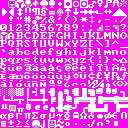
| | |size=6×6 | | |size=6×6 |
| | |resolution=480×150, 960times;300 | | |resolution=480×150, 960times;300 |
| − | |comments=A 6x6 Tileset optimised for legibility through personal use. Not shaded on most gliphs, aiming for a crisper look. Best at 2x2 pixels. | + | |comments=A 6x6 Tileset optimised for legibility through personal use. Not shaded on most glyphs, aiming for a crisper look. Best at 2x2 pixels. |
| | }} | | }} |
| | | | |
| Line 81: |
Line 81: |
| | |size=6×6 | | |size=6×6 |
| | |resolution=480×150 | | |resolution=480×150 |
| − | |comments=Made in 5 hours on 11/5/07 (I was bored and dissatisfied with other fonts). Most glyphs are really 5×6, with a seperator column. | + | |comments=Made in 5 hours on 11/5/07 (I was bored and dissatisfied with other fonts). Most glyphs are really 5×6, with a separator column. |
| | }} | | }} |
| | | | |
| Line 90: |
Line 90: |
| | |size=6×6 | | |size=6×6 |
| | |resolution=480×150 | | |resolution=480×150 |
| − | |comments=Version 2.05. Updated 11/12/07 to de-fuzz uppercase letters, added serifs and clarified lowercase letters, made horizontal spacing consistent throughout character set, fixed one error in the double horizontal-left-right, single-vertical-up-down character, made exclamation points consistent, thinned out question mark and inverse question mark, sharpened sideways stemless arrows, clarified international characters, and clarified some greek letters. Since v2.0: fixed 'i' 'g', fixed Yen symbol, fixed smiley 0x01 to not have an extra line to its right, lowered the period and colon characters, fixed position of 'x'. Thanks to Markavian for ideas on how to improve the font, as well as an occasional character glyph. | + | |comments=Version 2.05. Updated 11/12/07 to de-fuzz uppercase letters, added serifs and clarified lowercase letters, made horizontal spacing consistent throughout character set, fixed one error in the double horizontal-left-right, single-vertical-up-down character, made exclamation points consistent, thinned out question mark and inverse question mark, sharpened sideways stemless arrows, clarified international characters, and clarified some Greek letters. Since v2.0: fixed 'i' 'g', fixed Yen symbol, fixed smiley 0x01 to not have an extra line to its right, lowered the period and colon characters, fixed position of 'x'. Thanks to Markavian for ideas on how to improve the font, as well as an occasional character glyph. |
| | |demo=[[Image:Nightmare_6x6_v2.jpg|thumb|right|Lord Nightmare's 6x6 v2]] | | |demo=[[Image:Nightmare_6x6_v2.jpg|thumb|right|Lord Nightmare's 6x6 v2]] |
| | }} | | }} |
| Line 100: |
Line 100: |
| | |size=6×6 | | |size=6×6 |
| | |resolution=480×150 | | |resolution=480×150 |
| − | |comments=The first version the tiny tileset, superceded by the version below. | + | |comments=The first version of the tiny tileset, superseded by the version below. |
| | }} | | }} |
| | | | |
| Line 301: |
Line 301: |
| | |size=9×9 | | |size=9×9 |
| | |resolution=720×225 | | |resolution=720×225 |
| − | |comments=Another square tileset that's usable on low resolutions, modeled after a common font used on the Nintendo Entertainment System. I also made a [[:Image:Nostalgia_1440x450_3e4a08.png|18x18 version]] to fit my 1440x900 screen, back when the aspect ratio of DF was locked. If you like your set a bit more graphical, check out [[:Image:Teeto_K_18x18.PNG|Teeto_K's version]]. | + | |comments=Another square tileset that's usable on low resolutions, modelled after a common font used on the Nintendo Entertainment System. I also made a [[:Image:Nostalgia_1440x450_3e4a08.png|18x18 version]] to fit my 1440x900 screen, back when the aspect ratio of DF was locked. If you like your set a bit more graphical, check out [[:Image:Teeto_K_18x18.PNG|Teeto_K's version]]. |
| | }} | | }} |
| | | | |
| Line 417: |
Line 417: |
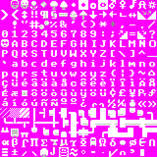
| | |size=10×10 | | |size=10×10 |
| | |resolution=800×250 native, 800×500 for fullscreen. | | |resolution=800×250 native, 800×500 for fullscreen. |
| − | |comments=I tried to make all the pictographic symbols as descriptive as possible: the only ones I've spotted that show up in odd places are the staircase symbols, '<' and '>', which are used as tags on barrel descriptions, and don't match -- but I'm willing to live with that in order to be able to tell up-stairs from down- ones. With everything else, I just tried to maximize clarity and readability and to keep them consistent. I'm really very pleased with how this set turned out. | + | |comments=I tried to make all the pictographic symbols as descriptive as possible: the only ones I've spotted that show up in odd places are the staircase symbols, '<' and '>', which are used as tags on barrel descriptions, and don't match -- but I'm willing to live with that in order to be able to tell up-stairs from down-ones. With everything else, I just tried to maximize clarity and readability and to keep them consistent. I'm really very pleased with how this set turned out. |
| | |demo=[[Image:Df_tock10_1.PNG|thumb|right]] | | |demo=[[Image:Df_tock10_1.PNG|thumb|right]] |
| | }} | | }} |


